

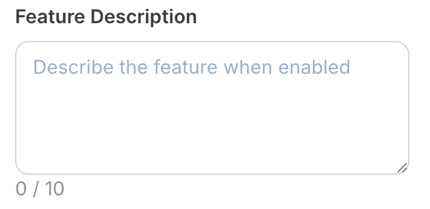
Compatibility
Properties
string
required
textarea - the type of the componentstring
required
A unique internal-only identifier that is posted to an app’s plugin server to share values inputted by the creator
string
required
Creator-facing identifier that is shown in the plugin environment (64 character limit)
string
Placeholder text displayed in the textarea when empty
string
Default value when the component first loads
number | null
Maximum character limit for the textarea content. Set to
null for unlimited lengthboolean
Determines whether the creator must enter text before proceeding
string
Brief creator-facing explanation that clarifies the component’s purpose and usage (256 character limit. Supports markdown:
[text](url), **bold**, and *italic*)object array
Allows for the field to be shown conditionally, dependent on other fields. See dependencies page for more details.