To get the most out of dependency with radio-groups utilize the A typical use case for this would be to create three pre-defined options and a final
value option whereby a field only shows when the corresponding value is selected, using the following syntax:Custom button, that exposes more granular functionality.Compatibility
| Plugin type | Availability | Additional notes |
|---|---|---|
| Content blocks | ||
| Media source |
Properties
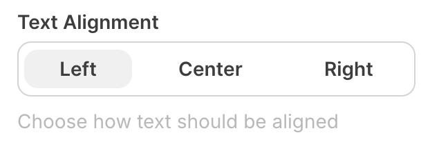
radioGroup - the type of the componentA unique internal-only identifier that is posted to an app’s plugin server to share values inputted by the creator
Creator-facing identifier that is shown in the plugin environment (64 character limit)
Array of objects containing label-value pairs for the radio button options
Default option value that is pre-selected when the component first loads
Determines whether the creator must make a selection before proceeding (defaults to false)
Brief creator-facing explanation that clarifies the component’s purpose and usage (256 character limit. Supports markdown:
[text](url), **bold**, and *italic*)Allows for the field to be shown conditionally. dependent on other fields. See dependencies page for more details.