Compatibility
| Plugin type | Availability | Additional notes |
|---|---|---|
| Content blocks | ||
| Media source |
Properties
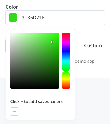
color - the type of the componentA unique internal-only identifier that is posted to an app’s plugin server to share values inputted by the creator
Creator-facing identifier that is shown in the plugin environment
Default color value that is pre-filled when the component first loads (e.g.
"#ff0000")Determines whether the creator must select a color before proceeding
Brief creator-facing explanation that clarifies the component’s purpose and usage. (256 character limit. Supports markdown:
[text](url), **bold**, and *italic*)When set to
true, displays a “Transparent” toggle that allows creators to set the color to transparent. Defaults to false.Allows for the field to be shown conditionally. dependent on other fields. See dependencies page for more details.
Best practices
Automatic styling
When using thecolor picker for content blocks, alongside the settings object, Kit also shares data on the styles used within the email template - allowing your plugin to assume the styling of the email automatically, to make it feel as native as possible.
Details on the style data available can be found below:
Supported HTML elements
Supported HTML elements
- p
- h1
- h2
- h3
- h4
- h5
- h6
- ol
- ul
- blockquote
- a
Example request
Example request