Compatibility
| Plugin type | Availability | Additional notes |
|---|---|---|
| Content blocks | ||
| Media source |
Properties
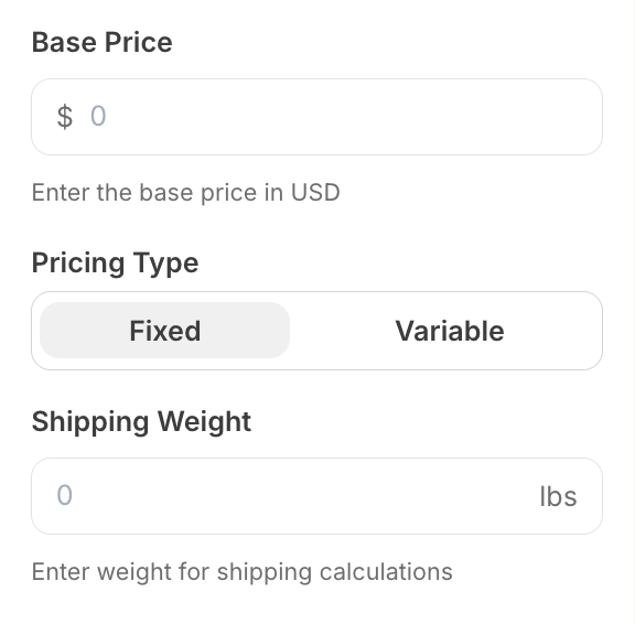
numericalInput - the type of the componentA unique internal-only identifier that is posted to an app’s plugin server to share values inputted by the creator
Creator-facing identifier that is shown in the plugin environment
Text or symbol displayed before the input field (e.g., ”$” for currency). Maximum 5 characters. Cannot be used with
append.Text or symbol displayed after the input field (e.g., “lbs” for weight). Maximum 5 characters. Cannot be used with
prepend.Maximum value allowed
Minimum value allowed
Default numeric value when the component first loads
Determines whether the creator must enter a value before proceeding
Brief creator-facing explanation that clarifies the component’s purpose and usage. (256 character limit. Supports markdown:
[text](url), **bold**, and *italic*)Allows for the field to be shown conditionally. dependent on other fields. See dependencies page for more details.
Important Notes
- Either
prependorappendmust be provided, but not both - The placeholder is automatically set to “0” and cannot be customized
- Input accepts decimal numbers and automatically validates numeric format