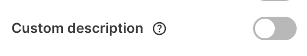
Fields dependent on toggles will only show when the toggle is switched on (i.e. has a value
true).Compatibility
| Plugin type | Availability | Additional notes |
|---|---|---|
| Content blocks | ||
| Media source |
Properties
toggle - the type of the componentA unique internal-only identifier that is posted to an app’s plugin server to share values inputted by the creator
Creator-facing identifier that is shown in the plugin environment (64 character limit)
Default state of the toggle when the component first loads
Determines whether the creator must interact with the toggle before proceeding
Brief creator-facing explanation that clarifies the component’s purpose and usage (256 character limit. Supports markdown:
[text](url), **bold**, and *italic*)Allows for the field to be shown conditionally. dependent on other fields. See dependencies page for more details.