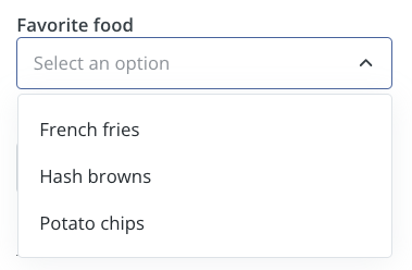
If you want to generate dynamic options, please use a search input instead.
Compatibility
| Plugin type | Availability | Additional notes |
|---|---|---|
| Content blocks | ||
| Media source | Available as part of the preset filter and sort group functionality. Check media source documentation for more details. |
Properties
select - the type of the componentA unique internal-only identifier that is posted to an app’s plugin server to share values inputted by the creator
Creator-facing identifier that is shown in the plugin environment
Array of objects containing label-value pairs for the dropdown options
Placeholder text displayed when no option is selected
Default option value that is pre-selected when the component first loads
Determines whether the creator must make a selection before proceeding
Brief creator-facing explanation that clarifies the component’s purpose and usage. (256 character limit. Supports markdown:
[text](url), **bold**, and *italic*)Allows for the field to be shown conditionally. dependent on other fields. See dependencies page for more details.