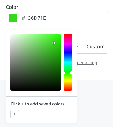
Color picker
The color picker lets creators customize colors for backgrounds, buttons, text and more to match their brand and email templates.
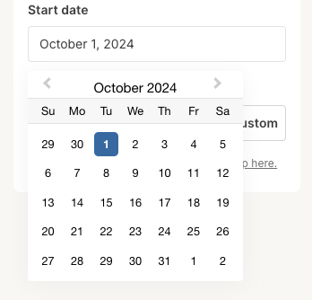
Date picker
The date picker lets creators select specific dates for time-sensitive content like events or promotions, with dates returned in standardized UTC format.
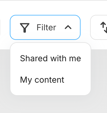
Dynamic select input
The dynamic select provides creators with a dropdown of server-fetched options to filter media gallery results in real-time.
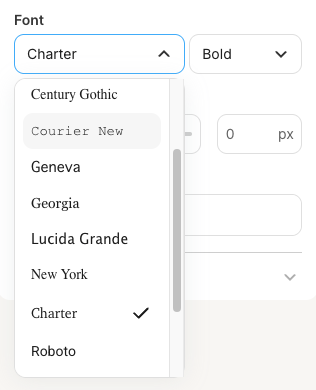
Font picker
The font picker lets creators select email-safe fonts and weights to match their brand and improve readability.
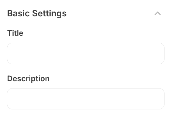
Group
The group component allows creators to organize settings into collapsible sections for better clarity in complex plugin configurations.
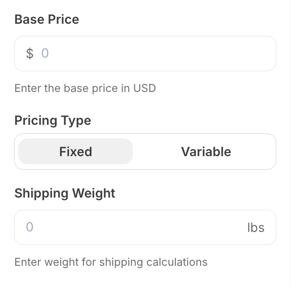
Numerical input
The numerical input lets creators enter numeric values with optional currency or unit indicators.
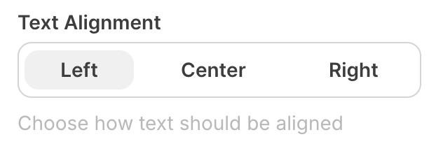
Radio group
The radio group lets creators choose from mutually exclusive options like alignment or layout modes through selectable buttons.
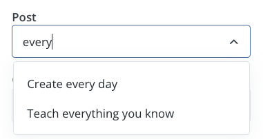
Search input
The search input lets creators search and select dynamic content from external sources with real-time functionality, supporting single or multiple selections.
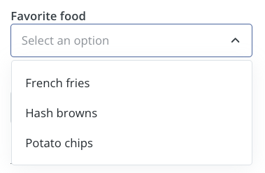
Select input
The select input provides creators with a dropdown of predefined options like categories or sizes, with the selected value passed to your plugin.
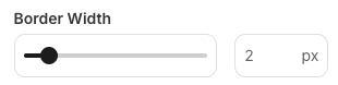
Slider
The slider lets creators select numerical values for properties like dimensions or quantities through a visual slider or direct input for precision.
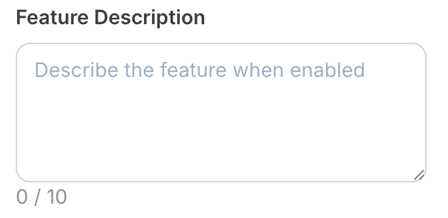
Textarea
The textarea lets creators enter multi-line text content like descriptions or messages in an expandable interface.
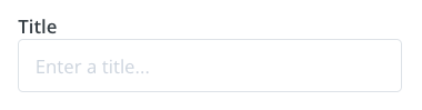
Text input
The text input lets creators enter short text like titles, names, or URLs in a single-line field.

Toggle
The toggle lets creators enable or disable features through a simple on/off switch with clear visual feedback.