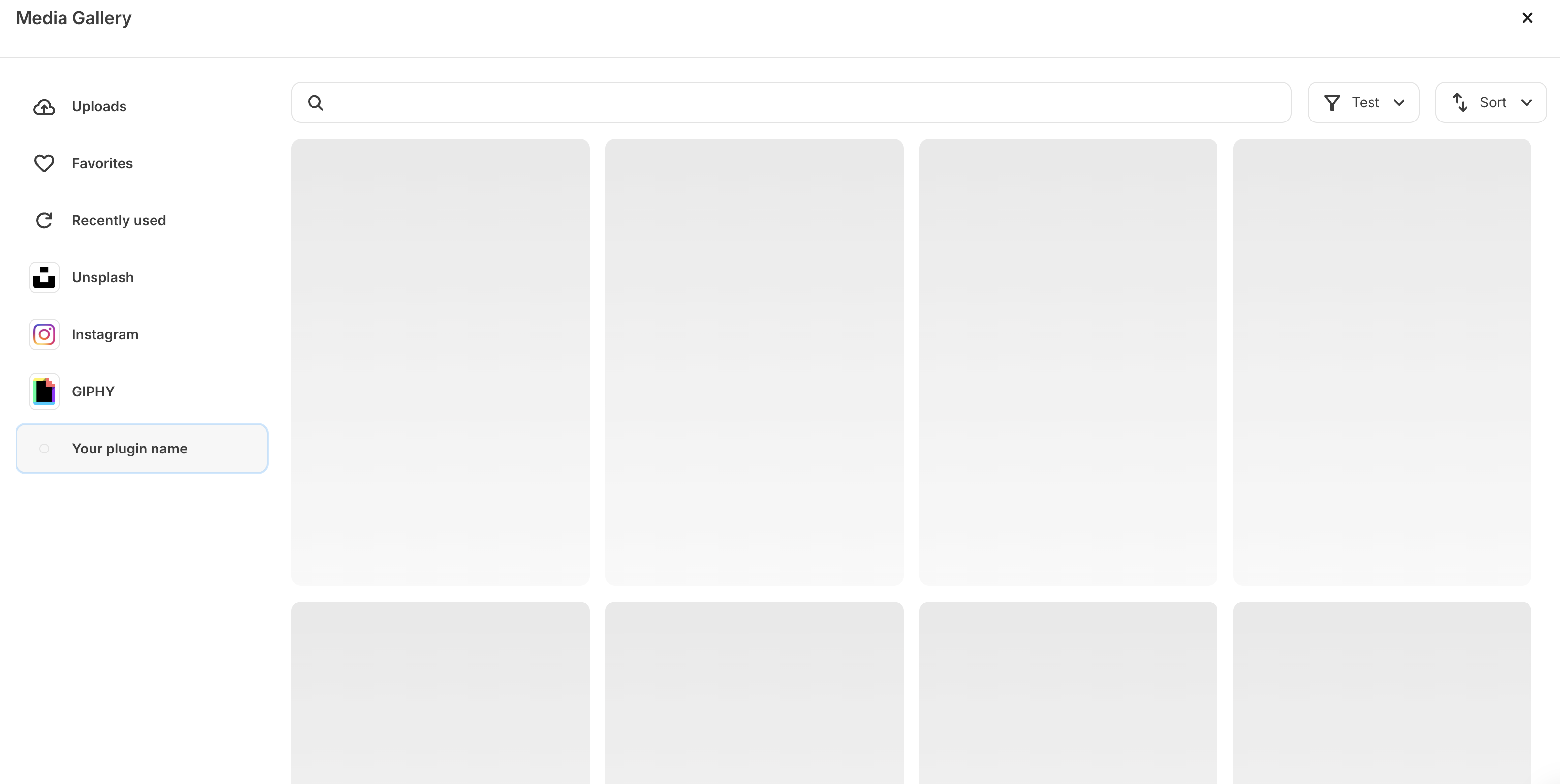
Example media gallery configuration
Example media gallery configuration
Compatible settings components
Components for media source plugins work slightly differently than other plugin types. Check below to see how to utilize our preset
search, filter and sort functionality, powered by groups:Search
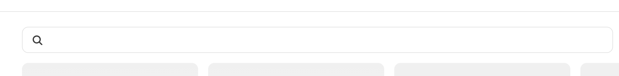
The optional search functionality utilizes a text input component, housed in a media source specificgroup called search_group - offering a way for creators to filter your images through a text filter.
request URL specified, with the text inputted, for your app to return a newly sorted version of results.
Example search component
Example search component
Filter
The optional filter functionality allows plugins to offer a flat, single-select dropdown the creator can select from to help them find the content they are looking for. This can be predefined through use of the select input component or programmatically generated as the plugin loads, through use of the dynamic select input component.Example filter component
Example filter component
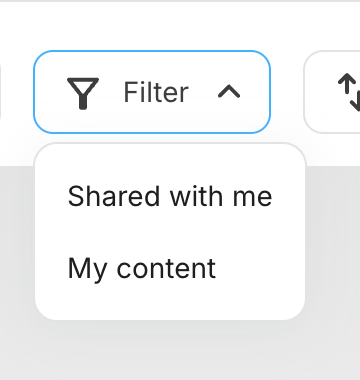
group, named filter_group.
Examples for each can be found below:
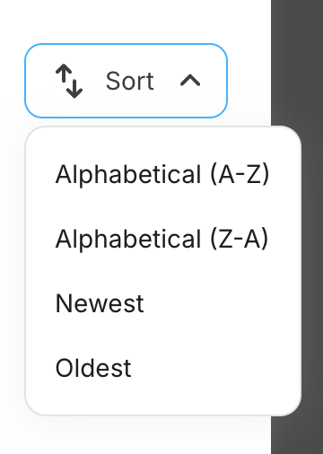
Sort
The optional sort functionality utilizes a select input component to offer a flat list of sort options the creator can select from, each with alabel and value nested in an options array. Once an option is selected, a new POST request will be made to the Request URL specified, with the value selected, for your app to return a newly sorted version of results. This will need to be encased by a media source specific group named sort_group.
Example sort component
Example sort component