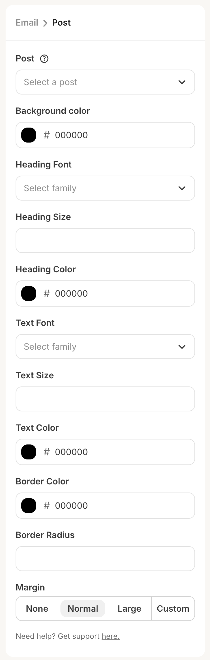
Compatible settings components
- Color picker
- Date picker
- Font picker
- Group
- Numerical input
- Radio group
- Search input
- Select input
- Slider
- Textarea
- Text input
- Toggle
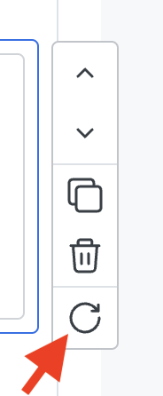
Refreshing data
After a user has configured all required settings, we will perform a request to your server for the block’s HTML. If the user wants to refresh the data, they can either:- Click the refresh button that appears when hovering over the element (pictured below), or
- Change one of your plugin’s settings in the sidebar, which will automatically kick off another request for new HTML.