> ## Documentation Index
> Fetch the complete documentation index at: https://developers.kit.com/llms.txt
> Use this file to discover all available pages before exploring further.
# Textarea
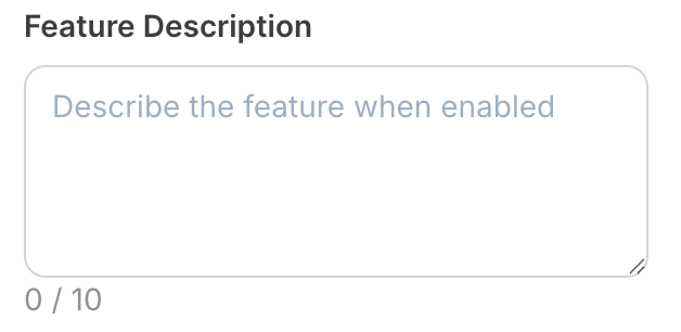
The textarea component allows creators to enter longer, multi-line text content. It's ideal for collecting descriptions, messages, body content, or any text that requires multiple lines and more space than a single-line input. The textarea provides an expandable interface that accommodates extensive text-based information.
 ## Compatibility
| Plugin type | Availability | Additional notes |
| -------------- | ---------------------------- | --------------------------------------------------------------------------------------------------------------------------------------------------- |
| Content blocks | | |
| Media source | | Available as part of the preset `search` functionality. Check [media source documentation](/plugins/media-source/plugin-settings) for more details. |
## Properties
`textarea` - the type of the component
A unique internal-only identifier that is posted to an app's plugin server to share values inputted by the creator
Creator-facing identifier that is shown in the plugin environment (64 character limit)
Placeholder text displayed in the textarea when empty
Default value when the component first loads
Maximum character limit for the textarea content. Set to `null` for unlimited length
Determines whether the creator must enter text before proceeding
Brief creator-facing explanation that clarifies the component's purpose and usage (256 character limit. Supports markdown: `[text](url)`, `**bold**`, and `*italic*`)
Allows for the field to be shown conditionally, dependent on other fields. See [dependencies page](/plugins/component-library/dependencies) for more details.
Name of the dependent field
Value for the dependent field required to show this field. To show when any value is inputted, leave out this property.
```json JSON setting theme={null}
{
"type": "textarea",
"name": "feature_description",
"label": "Feature Description",
"placeholder": "Describe the feature when enabled", // optional
"default": "This text describes the feature", // optional
"max_length": null, // optional - null for unlimited
"required": false, // optional
"help": "Only appears when feature toggle is enabled", // optional
"dependencies": [
{
"field": "enable_feature"
// no value property - shows when enable_feature has any value
}
] // optional
}
```
```json Example response theme={null}
{
"settings": {
"feature_description": "This feature enables advanced analytics tracking for user interactions, providing detailed insights into engagement patterns and conversion metrics. It includes real-time monitoring, custom event tracking, and comprehensive reporting dashboards."
// ...additional plugin settings
}
// ...plugin-specific additional data
}
```
## Compatibility
| Plugin type | Availability | Additional notes |
| -------------- | ---------------------------- | --------------------------------------------------------------------------------------------------------------------------------------------------- |
| Content blocks | | |
| Media source | | Available as part of the preset `search` functionality. Check [media source documentation](/plugins/media-source/plugin-settings) for more details. |
## Properties
`textarea` - the type of the component
A unique internal-only identifier that is posted to an app's plugin server to share values inputted by the creator
Creator-facing identifier that is shown in the plugin environment (64 character limit)
Placeholder text displayed in the textarea when empty
Default value when the component first loads
Maximum character limit for the textarea content. Set to `null` for unlimited length
Determines whether the creator must enter text before proceeding
Brief creator-facing explanation that clarifies the component's purpose and usage (256 character limit. Supports markdown: `[text](url)`, `**bold**`, and `*italic*`)
Allows for the field to be shown conditionally, dependent on other fields. See [dependencies page](/plugins/component-library/dependencies) for more details.
Name of the dependent field
Value for the dependent field required to show this field. To show when any value is inputted, leave out this property.
```json JSON setting theme={null}
{
"type": "textarea",
"name": "feature_description",
"label": "Feature Description",
"placeholder": "Describe the feature when enabled", // optional
"default": "This text describes the feature", // optional
"max_length": null, // optional - null for unlimited
"required": false, // optional
"help": "Only appears when feature toggle is enabled", // optional
"dependencies": [
{
"field": "enable_feature"
// no value property - shows when enable_feature has any value
}
] // optional
}
```
```json Example response theme={null}
{
"settings": {
"feature_description": "This feature enables advanced analytics tracking for user interactions, providing detailed insights into engagement patterns and conversion metrics. It includes real-time monitoring, custom event tracking, and comprehensive reporting dashboards."
// ...additional plugin settings
}
// ...plugin-specific additional data
}
```