> ## Documentation Index
> Fetch the complete documentation index at: https://developers.kit.com/llms.txt
> Use this file to discover all available pages before exploring further.
# Text input
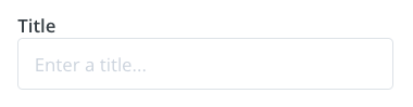
The text input allows creators to enter short snippets of text in a single-line field. It's perfect for collecting titles, names, URLs, or any brief text content that doesn't require multiple lines. The input provides a clean, straightforward interface for essential text-based information.
 ## Compatibility
| Plugin type | Availability | Additional notes |
| -------------- | ---------------------------- | --------------------------------------------------------------------------------------------------------------------------------------------------- |
| Content blocks | | |
| Media source | | Available as part of the preset `search` functionality. Check [media source documentation](/plugins/media-source/plugin-settings) for more details. |
## Properties
`text` - the type of the component
A unique internal-only identifier that is posted to an app's plugin server to share values inputted by the creator
Creator-facing identifier that is shown in the plugin environment
Placeholder text displayed in the input field when empty
Default text value that is pre-filled when the component first loads
Determines whether the creator must enter text before proceeding
Brief creator-facing explanation that clarifies the component's purpose and usage. (256 character limit. Supports markdown: `[text](url)`, `**bold**`, and `*italic*`)
Allows for the field to be shown conditionally. dependent on other fields. See [dependencies page](/plugins/component-library/dependencies) for more details.
Name of the dependent field
Value for the dependent field required to show this field. To show when any value is inputted, leave out this property.
```json JSON setting theme={null}
{
"type": "text",
"name": "title",
"label": "Title",
"placeholder": "Enter a title...", // optional
"default": "Buy Now", // optional
"required": true, // optional
"help": "help text shown in tooltip to creator while editing", // optional
"dependencies": [
{
"field": "dependent_field",
"value": "dependent_value" //optional
}
] // optional
}
```
```json Example response theme={null}
{
"settings": {
"title": "My Amazing Email Campaign"
// ...additional plugin settings
}
// ...plugin-specific additional data
}
```
## Compatibility
| Plugin type | Availability | Additional notes |
| -------------- | ---------------------------- | --------------------------------------------------------------------------------------------------------------------------------------------------- |
| Content blocks | | |
| Media source | | Available as part of the preset `search` functionality. Check [media source documentation](/plugins/media-source/plugin-settings) for more details. |
## Properties
`text` - the type of the component
A unique internal-only identifier that is posted to an app's plugin server to share values inputted by the creator
Creator-facing identifier that is shown in the plugin environment
Placeholder text displayed in the input field when empty
Default text value that is pre-filled when the component first loads
Determines whether the creator must enter text before proceeding
Brief creator-facing explanation that clarifies the component's purpose and usage. (256 character limit. Supports markdown: `[text](url)`, `**bold**`, and `*italic*`)
Allows for the field to be shown conditionally. dependent on other fields. See [dependencies page](/plugins/component-library/dependencies) for more details.
Name of the dependent field
Value for the dependent field required to show this field. To show when any value is inputted, leave out this property.
```json JSON setting theme={null}
{
"type": "text",
"name": "title",
"label": "Title",
"placeholder": "Enter a title...", // optional
"default": "Buy Now", // optional
"required": true, // optional
"help": "help text shown in tooltip to creator while editing", // optional
"dependencies": [
{
"field": "dependent_field",
"value": "dependent_value" //optional
}
] // optional
}
```
```json Example response theme={null}
{
"settings": {
"title": "My Amazing Email Campaign"
// ...additional plugin settings
}
// ...plugin-specific additional data
}
```