> ## Documentation Index
> Fetch the complete documentation index at: https://developers.kit.com/llms.txt
> Use this file to discover all available pages before exploring further.
# Slider
The slider provides creators with an intuitive way to select numerical values through a visual slider interface combined with a numerical input box. It's perfect for precise control over design properties like corner radius, border width, pixel dimensions, or quantities. The dual interface allows creators to either drag the slider for quick adjustments or type exact values for precision.
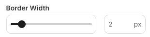 Fields cannot be dependent on sliders as they always have a value.
## Compatibility
| Plugin type | Availability | Additional notes |
| -------------- | ---------------------------- | ---------------- |
| Content blocks | | |
| Media source | | |
## Properties
`slider` - the type of the component
A unique internal-only identifier that is posted to an app's plugin server to share values inputted by the creator
Creator-facing identifier that is shown in the plugin environment (64 character limit)
Maximum value allowed on the slider
Minimum value allowed on the slider
Increment value for slider movement and input validation
Default value when the component first loads
Determines whether the creator must set a value before proceeding, defaults to `false`
Brief creator-facing explanation that clarifies the component's purpose and usage (256 character limit. Supports markdown: `[text](url)`, `**bold**`, and `*italic*`)
Unit or label displayed after the value (3 character limit, defaults to null). If `null` or absent, the suffix won't show
Allows for the field to be shown conditionally. dependent on other fields. See [dependencies page](/plugins/component-library/dependencies) for more details.
Name of the dependent field
Value for the dependent field required to show this field. To show when any value is inputted, leave out this property.
```json JSON setting theme={null}
{
"name": "border_width",
"label": "Border Width",
"required": false, // optional
"help": "Set the border width in pixels", // optional
"type": "slider",
"max": 20,
"min": 0,
"step": 1,
"default": 2,
"suffix": "px", // optional
"dependencies": [
{
"field": "dependent_field",
"value": "dependent_value" //optional
}
] // optional
}
```
```json Example response theme={null}
{
"settings": {
"border_width": 5
// ...additional plugin settings
}
// ...plugin-specific additional data
}
```
Fields cannot be dependent on sliders as they always have a value.
## Compatibility
| Plugin type | Availability | Additional notes |
| -------------- | ---------------------------- | ---------------- |
| Content blocks | | |
| Media source | | |
## Properties
`slider` - the type of the component
A unique internal-only identifier that is posted to an app's plugin server to share values inputted by the creator
Creator-facing identifier that is shown in the plugin environment (64 character limit)
Maximum value allowed on the slider
Minimum value allowed on the slider
Increment value for slider movement and input validation
Default value when the component first loads
Determines whether the creator must set a value before proceeding, defaults to `false`
Brief creator-facing explanation that clarifies the component's purpose and usage (256 character limit. Supports markdown: `[text](url)`, `**bold**`, and `*italic*`)
Unit or label displayed after the value (3 character limit, defaults to null). If `null` or absent, the suffix won't show
Allows for the field to be shown conditionally. dependent on other fields. See [dependencies page](/plugins/component-library/dependencies) for more details.
Name of the dependent field
Value for the dependent field required to show this field. To show when any value is inputted, leave out this property.
```json JSON setting theme={null}
{
"name": "border_width",
"label": "Border Width",
"required": false, // optional
"help": "Set the border width in pixels", // optional
"type": "slider",
"max": 20,
"min": 0,
"step": 1,
"default": 2,
"suffix": "px", // optional
"dependencies": [
{
"field": "dependent_field",
"value": "dependent_value" //optional
}
] // optional
}
```
```json Example response theme={null}
{
"settings": {
"border_width": 5
// ...additional plugin settings
}
// ...plugin-specific additional data
}
```