> ## Documentation Index
> Fetch the complete documentation index at: https://developers.kit.com/llms.txt
> Use this file to discover all available pages before exploring further.
# Select input
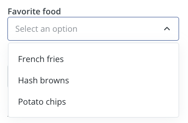
The select input provides creators with a dropdown menu containing predefined options. It's ideal for scenarios where you need to present a fixed set of choices such as categories, sizes, or configuration options. The selected value is hidden from creators but passed to your plugin for processing.
If you want to generate dynamic options, please use a [search input](/plugins/component-library/search-input) instead.
 ## Compatibility
| Plugin type | Availability | Additional notes |
| -------------- | ---------------------------- | -------------------------------------------------------------------------------------------------------------------------------------------------------------------- |
| Content blocks | | |
| Media source | | Available as part of the preset `filter` and `sort` group functionality. Check [media source documentation](/plugins/media-source/plugin-settings) for more details. |
## Properties
`select` - the type of the component
A unique internal-only identifier that is posted to an app's plugin server to share values inputted by the creator
Creator-facing identifier that is shown in the plugin environment
Array of objects containing label-value pairs for the dropdown options
Placeholder text displayed when no option is selected
Default option value that is pre-selected when the component first loads
Determines whether the creator must make a selection before proceeding
Brief creator-facing explanation that clarifies the component's purpose and usage. (256 character limit. Supports markdown: `[text](url)`, `**bold**`, and `*italic*`)
Allows for the field to be shown conditionally. dependent on other fields. See [dependencies page](/plugins/component-library/dependencies) for more details.
Name of the dependent field
Value for the dependent field required to show this field. To show when any value is inputted, leave out this property.
```json JSON setting theme={null}
{
"type": "select",
"name": "favorite_food",
"label": "Favorite food",
"options": [
{
"label": "French fries",
"value": "food-id-1"
},
{
"label": "Hash browns",
"value": "food-id-2"
},
{
"label": "Potato chips",
"value": "food-id-3"
}
],
"placeholder": "Select a food...", // optional
"default": "food-id-1", // optional
"required": true, // optional
"help": "help text shown in tooltip to creator while editing", // optional
"dependencies": [
{
"field": "dependent_field",
"value": "dependent_value" //optional
}
] // optional
}
```
```json Example response theme={null}
{
"settings": {
"favorite_food": "food-id-2"
// ...additional plugin settings
}
// ...plugin-specific additional data
}
```
## Compatibility
| Plugin type | Availability | Additional notes |
| -------------- | ---------------------------- | -------------------------------------------------------------------------------------------------------------------------------------------------------------------- |
| Content blocks | | |
| Media source | | Available as part of the preset `filter` and `sort` group functionality. Check [media source documentation](/plugins/media-source/plugin-settings) for more details. |
## Properties
`select` - the type of the component
A unique internal-only identifier that is posted to an app's plugin server to share values inputted by the creator
Creator-facing identifier that is shown in the plugin environment
Array of objects containing label-value pairs for the dropdown options
Placeholder text displayed when no option is selected
Default option value that is pre-selected when the component first loads
Determines whether the creator must make a selection before proceeding
Brief creator-facing explanation that clarifies the component's purpose and usage. (256 character limit. Supports markdown: `[text](url)`, `**bold**`, and `*italic*`)
Allows for the field to be shown conditionally. dependent on other fields. See [dependencies page](/plugins/component-library/dependencies) for more details.
Name of the dependent field
Value for the dependent field required to show this field. To show when any value is inputted, leave out this property.
```json JSON setting theme={null}
{
"type": "select",
"name": "favorite_food",
"label": "Favorite food",
"options": [
{
"label": "French fries",
"value": "food-id-1"
},
{
"label": "Hash browns",
"value": "food-id-2"
},
{
"label": "Potato chips",
"value": "food-id-3"
}
],
"placeholder": "Select a food...", // optional
"default": "food-id-1", // optional
"required": true, // optional
"help": "help text shown in tooltip to creator while editing", // optional
"dependencies": [
{
"field": "dependent_field",
"value": "dependent_value" //optional
}
] // optional
}
```
```json Example response theme={null}
{
"settings": {
"favorite_food": "food-id-2"
// ...additional plugin settings
}
// ...plugin-specific additional data
}
```