> ## Documentation Index
> Fetch the complete documentation index at: https://developers.kit.com/llms.txt
> Use this file to discover all available pages before exploring further.
# Search input
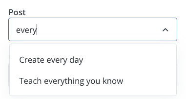
The search input allows creators to search and select from dynamic content sourced from external APIs or databases. It provides real-time search functionality with debounced requests, supports dependencies on other form inputs, and can handle both single and multiple selections. This component is ideal for selecting blog posts, products, categories, or any searchable content.
 ## Compatibility
| Plugin type | Availablity | Additional notes |
| -------------- | ---------------------------- | ---------------- |
| Content blocks | | |
| Media source | | |
## Request URL behaviour
The behaviour of the `request_url` property is specific to the plugin environment in which it is used.
The sections below outline the differences between plugin environments:
* **Initial load**: When a creator adds a content block, Kit makes a request with an empty search parameter to populate default results
* **User typing**: Debounced request made by Kit with the user's search query
* **Draft restoration**: If a creator leaves their email in a draft state and edits again in the future, we’ll make a request to your provided request\_url with the value of the option they had previously selected. This allows us to fill the dropdown with your user-friendly label.
Your endpoint should return an array of label-value pairs:
```json theme={null}
{
"data": [
{
"label": "A post title",
"value": "post-id-123"
}
]
}
```
For error handling, include an errors array:
```json theme={null}
{
"data": [],
"errors": ["Plan not found"]
}
```
COMING SOON
## Properties
`search` - the type of the component
A unique internal-only identifier that is posted to an app's plugin server to share values inputted by the creator
Creator-facing identifier that is shown in the plugin environment
The endpoint URL that Kit will call to fetch search results
Placeholder text displayed in the search input field
Determines whether the creator must make a selection before proceeding
Brief creator-facing explanation that clarifies the component's purpose and usage. (256 character limit. Supports markdown: `[text](url)`, `**bold**`, and `*italic*`)
Allows for the field to be shown conditionally. dependent on other fields. See [dependencies page](/plugins/component-library/dependencies) for more details.
We maintain backwards compatibility for string arrays but recommend using the object format going forwards.
Name of the dependent field
Value for the dependent field required to show this field. To show when any value is inputted, leave out this property.
Enables multiple selection when set to true
## Best practices
* Ensure the initial empty state is handled, offering default options when no input is given
* Use a sensible sort order for your data - for example alphabetical, most recently created or most popular
* Ensure labels are clear, short and unique so that creators know exactly what they are selecting
```json JSON setting theme={null}
{
"type": "search",
"name": "post",
"label": "Post",
"request_url": "https://example.com/path/to/your/search/endpoint",
"placeholder": "Select a post", // optional
"required": true, // optional
"help": "help text shown in tooltip to creator while editing", // optional
"multiselect": false, // optional
"dependencies": [
{
"field": "dependent_field",
"value": "dependent_value" //optional
}
] // optional
}
```
```json Example response (single select) theme={null}
{
"settings": {
"post": "post-id-123"
// ...additional plugin settings
}
// ...plugin-specific additional data
}
```
```json (multiple select) theme={null}
{
"settings": {
"post": ["post-id-123", "post-id-456"]
// ...additional plugin settings
}
// ...plugin-specific additional data
}
```
## Compatibility
| Plugin type | Availablity | Additional notes |
| -------------- | ---------------------------- | ---------------- |
| Content blocks | | |
| Media source | | |
## Request URL behaviour
The behaviour of the `request_url` property is specific to the plugin environment in which it is used.
The sections below outline the differences between plugin environments:
* **Initial load**: When a creator adds a content block, Kit makes a request with an empty search parameter to populate default results
* **User typing**: Debounced request made by Kit with the user's search query
* **Draft restoration**: If a creator leaves their email in a draft state and edits again in the future, we’ll make a request to your provided request\_url with the value of the option they had previously selected. This allows us to fill the dropdown with your user-friendly label.
Your endpoint should return an array of label-value pairs:
```json theme={null}
{
"data": [
{
"label": "A post title",
"value": "post-id-123"
}
]
}
```
For error handling, include an errors array:
```json theme={null}
{
"data": [],
"errors": ["Plan not found"]
}
```
COMING SOON
## Properties
`search` - the type of the component
A unique internal-only identifier that is posted to an app's plugin server to share values inputted by the creator
Creator-facing identifier that is shown in the plugin environment
The endpoint URL that Kit will call to fetch search results
Placeholder text displayed in the search input field
Determines whether the creator must make a selection before proceeding
Brief creator-facing explanation that clarifies the component's purpose and usage. (256 character limit. Supports markdown: `[text](url)`, `**bold**`, and `*italic*`)
Allows for the field to be shown conditionally. dependent on other fields. See [dependencies page](/plugins/component-library/dependencies) for more details.
We maintain backwards compatibility for string arrays but recommend using the object format going forwards.
Name of the dependent field
Value for the dependent field required to show this field. To show when any value is inputted, leave out this property.
Enables multiple selection when set to true
## Best practices
* Ensure the initial empty state is handled, offering default options when no input is given
* Use a sensible sort order for your data - for example alphabetical, most recently created or most popular
* Ensure labels are clear, short and unique so that creators know exactly what they are selecting
```json JSON setting theme={null}
{
"type": "search",
"name": "post",
"label": "Post",
"request_url": "https://example.com/path/to/your/search/endpoint",
"placeholder": "Select a post", // optional
"required": true, // optional
"help": "help text shown in tooltip to creator while editing", // optional
"multiselect": false, // optional
"dependencies": [
{
"field": "dependent_field",
"value": "dependent_value" //optional
}
] // optional
}
```
```json Example response (single select) theme={null}
{
"settings": {
"post": "post-id-123"
// ...additional plugin settings
}
// ...plugin-specific additional data
}
```
```json (multiple select) theme={null}
{
"settings": {
"post": ["post-id-123", "post-id-456"]
// ...additional plugin settings
}
// ...plugin-specific additional data
}
```