> ## Documentation Index
> Fetch the complete documentation index at: https://developers.kit.com/llms.txt
> Use this file to discover all available pages before exploring further.
# Group
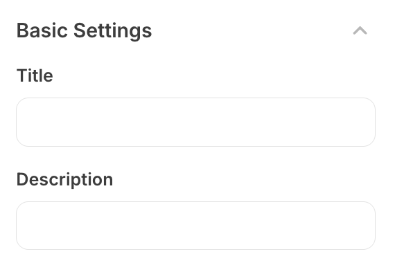
The group component provides a collapsible organizational structure for grouping related plugin settings together. It creates an expandable/collapsible section with a clear label and optional help text, making it easy for app developers to manage complex plugin configurations by organizing them into logical groups. The component allows for better user experience when dealing with plugins that have many settings.
 ## Compatibility
| Plugin type | Availability | Additional notes |
| -------------- | ---------------------------- | --------------------------------------------------------------------------------------------------------------------------------------------------- |
| Content blocks | | |
| Media source | | Available as part of the preset `search` functionality. Check [media source documentation](/plugins/media-source/plugin-settings) for more details. |
## Properties
`group` - the type of the component
Creator-facing identifier that is shown as the group header in the plugin
environment
Array of child setting objects that will be displayed within the collapsed
group. Each setting should be a valid plugin setting component.
Brief creator-facing explanation that clarifies the group's purpose and usage. (256 character limit. Supports markdown: `[text](url)`, `**bold**`, and `*italic*`)
Allows for the group to be shown conditionally, dependent on other fields. See
[dependencies page](/plugins/component-library/dependencies) for more details.
Name of the dependent field
Value for the dependent field required to show this group. To show when
any value is inputted, leave out this property.
## Testing Examples
### Simple Group (Copy & Paste Ready)
```json theme={null}
{
"type": "group",
"label": "Basic Settings",
"name": "basic_settings",
"settings": [
{
"type": "text",
"name": "title",
"label": "Title"
},
{
"type": "text",
"name": "description",
"label": "Description"
}
]
}
```
### Group with Help Text
```json theme={null}
{
"type": "group",
"label": "Advanced Settings",
"name": "basic_settings",
"help": "Configure advanced options here",
"settings": [
{
"type": "text",
"name": "api_key",
"label": "API Key",
"placeholder": "Enter your API key"
},
{
"type": "select",
"name": "timeout",
"label": "Timeout",
"options": [
{ "label": "5 seconds", "value": "5" },
{ "label": "10 seconds", "value": "10" }
]
}
]
}
```
### Group with Dependencies
```json theme={null}
{
"type": "group",
"label": "Optional Features",
"name": "basic_settings",
"settings": [
{
"type": "text",
"name": "webhook_url",
"label": "Webhook URL"
}
],
"dependencies": [
{
"field": "enable_webhooks",
"value": "true"
}
]
}
```
```json Example response theme={null}
{
"settings": {
"title": "My Plugin Title",
"description": "Plugin description here",
"api_key": "abc123xyz",
"timeout": "10",
"webhook_url": "https://example.com/webhook"
}
}
```
## Compatibility
| Plugin type | Availability | Additional notes |
| -------------- | ---------------------------- | --------------------------------------------------------------------------------------------------------------------------------------------------- |
| Content blocks | | |
| Media source | | Available as part of the preset `search` functionality. Check [media source documentation](/plugins/media-source/plugin-settings) for more details. |
## Properties
`group` - the type of the component
Creator-facing identifier that is shown as the group header in the plugin
environment
Array of child setting objects that will be displayed within the collapsed
group. Each setting should be a valid plugin setting component.
Brief creator-facing explanation that clarifies the group's purpose and usage. (256 character limit. Supports markdown: `[text](url)`, `**bold**`, and `*italic*`)
Allows for the group to be shown conditionally, dependent on other fields. See
[dependencies page](/plugins/component-library/dependencies) for more details.
Name of the dependent field
Value for the dependent field required to show this group. To show when
any value is inputted, leave out this property.
## Testing Examples
### Simple Group (Copy & Paste Ready)
```json theme={null}
{
"type": "group",
"label": "Basic Settings",
"name": "basic_settings",
"settings": [
{
"type": "text",
"name": "title",
"label": "Title"
},
{
"type": "text",
"name": "description",
"label": "Description"
}
]
}
```
### Group with Help Text
```json theme={null}
{
"type": "group",
"label": "Advanced Settings",
"name": "basic_settings",
"help": "Configure advanced options here",
"settings": [
{
"type": "text",
"name": "api_key",
"label": "API Key",
"placeholder": "Enter your API key"
},
{
"type": "select",
"name": "timeout",
"label": "Timeout",
"options": [
{ "label": "5 seconds", "value": "5" },
{ "label": "10 seconds", "value": "10" }
]
}
]
}
```
### Group with Dependencies
```json theme={null}
{
"type": "group",
"label": "Optional Features",
"name": "basic_settings",
"settings": [
{
"type": "text",
"name": "webhook_url",
"label": "Webhook URL"
}
],
"dependencies": [
{
"field": "enable_webhooks",
"value": "true"
}
]
}
```
```json Example response theme={null}
{
"settings": {
"title": "My Plugin Title",
"description": "Plugin description here",
"api_key": "abc123xyz",
"timeout": "10",
"webhook_url": "https://example.com/webhook"
}
}
```